Do you need a new website or just a face-lift?
Many nonprofits come to us for help with branding, some need to change their name, some have a new mission or are expanding, while others are kicking off a capital or anniversary campaign. Regardless, every nonprofit needs to consider how to quickly and compellingly present themselves, and your website is one of your most essential marketing tools. For some visitors, it will be their first experience to learn about your services and programs, so you need to be immediately informative and effective. Other visitors who are more familiar with your organization may be coming back to learn more, so developing a connection to your organization is key to engaging them further.
We are often asked to audit a nonprofit’s communications, especially their website, and make a recommendation – do they need to invest in a new website or can they just refresh their existing site?
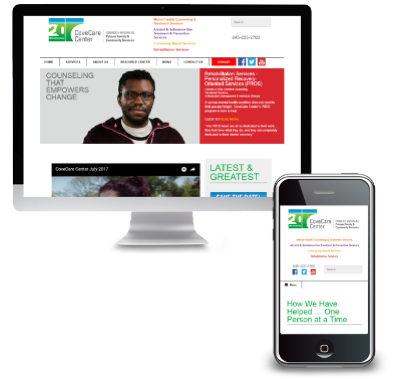
New CoveCare Website
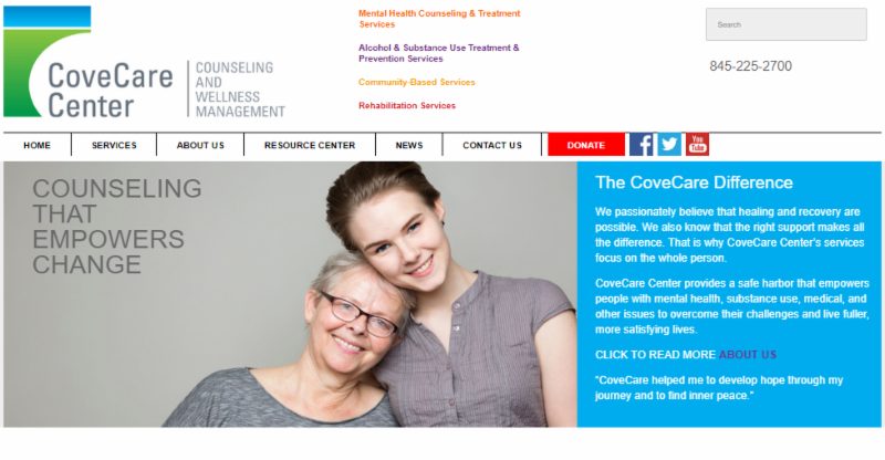
Putnam Family and Community Services changed its name to CoveCare Center and added a new tagline, video, and a mobile website. (Branding by Diane DePaolis at Growth for Good and website by Westchester Marketing Cafe)
Here are three times that we recommend creating a new website:
- If your existing website is not mobile-friendly or responsive and potential clients are struggling to learn more about your programs, upgrade now. Telephone and walk-in access are not enough in a digital age. To deliver on your mission and serve your community, your website provides equitable access to knowledge and help.
- If you are changing your nonprofit’s name, URL, emails, vision/mission, etc., your brand will benefit from the investment in a more contemporary look and new copy to present your reason for rebranding and repositioning. Most commonly this is when a nonprofit needs to reposition itself, be more distinctive/competitive, and/or because its name no longer communicates who it is today and what it stands for.
- If you are updating your logo and/or celebrating an anniversary, it’s a perfect time to readdress your image across all media and start with a new distinctive digital look and feel. Your website should present your brand image and be at the core of your brand experience. Update your organization’s logo/symbol, core language, color palette, photographic style, and typography. Make sure that it’s pulled through to all communications (including digital!), consistently presenting your vision for the future.
New Mobile Website
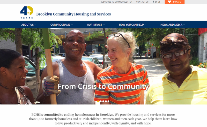
Brooklyn Community Housing and Services celebrated its 40th anniversary by launching a new mobile-friendly website. (Website by Letter 7 Design)
Here are three times that we recommend not creating a new website:
- If your website looks outdated, consider a refresh. Taking outdated graphics and replacing them with a clean, contemporary look and new professional photos can make a world of difference. Redesigning can spark an interest, reposition your agency, and reconnect your brand to your purpose with images and videos that tell your story.
- If you are ‘going social,’don’t just add a button or link, consider using this opportunity to improve your marketing performance and set up analytics. Social media should increase website traffic and help with search engine optimization. Before you invest in a new website, add Google analytics and track features designed to engage your visitor to learn more (watch our video and like us on Facebook). Refresh your website to include response techniques like a prominent donate button, an e-news sign-up box, and scrolling banners with buttons.
- If your web traffic analytics are showing decreasing visitors and lower click-through rate, then give your home page a face-lift first. Your home, programs, and donate pages are the most essential to track. If you are not getting page views or you are losing donors, clarify your navigation and make sure your home page provides the ‘what, why, where, and how’ you do what you do. Use short copy with highlighted key word phrases, update your content frequently, and add photos that communicate your vision. For better search engine optimization, use metadata and text descriptions for images.
If you are considering a rebrand or refresh, please contact us to help you audit your website and communications. We would like to help you present your services and engage supporters in the most efficient and effective way possible.
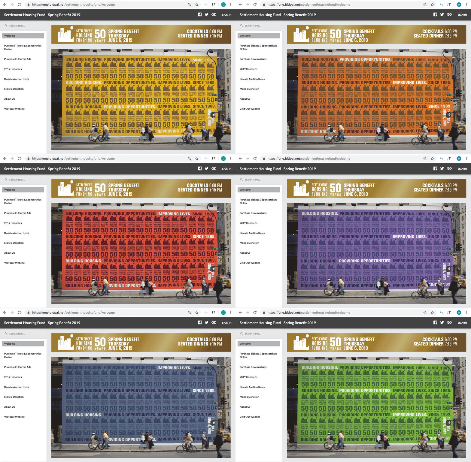
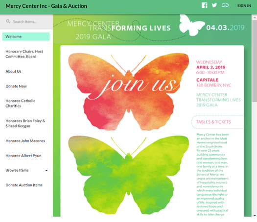
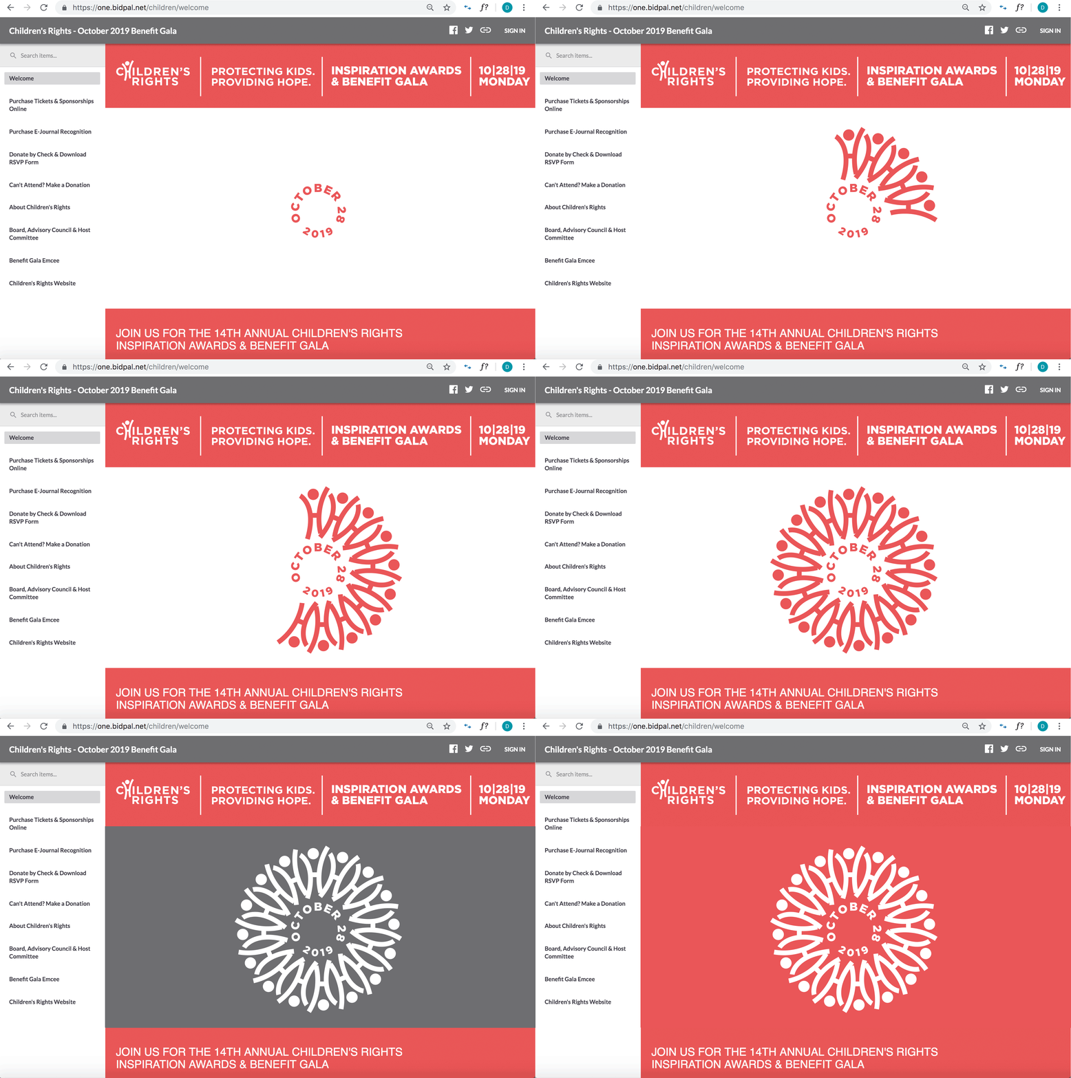
Below are a couple of websites that Growth for Good has produced that provided a fresh new look for our clients’ fundraising events: Mercy Center website graphics by Jen Schuetz, and Settlement Housing Fund and Children’s Rights website design by Diane DePaolis. Our event websites often use animated gif images to tell a more in-depth story and quickly create a positive energy.
“Growth for Good’s assistance has been invaluable. We are so grateful for their extraordinary hard work, insight and experience, and most especially for their patience and good nature.”
– Debbie Levin, former director of development, CoveCare Center
Recent Posts
Subscribe to Our Newsletter
* These fields are required.
Contact Us
500 Summit Avenue
Maplewood, NJ 07040
P: 973-762-7645
E: contact@growthforgood.com
